
Chapter 1: Introduction to Geography
1.3 Geography – The Spatial Perspective
1.3.1 Spatial Thinking
At no other time in the history of the world has it been easier to create or acquire a map of anything? Maps and mapping technology are literally and virtually everywhere. Though the modes and means of making and distributing maps have been revolutionized with recent advances in computing like the Internet, the art and science of map-making date back centuries. This is because humans are inherently spatial organisms, and for us to live in the world, we must somehow relate to it. Enter the mental map.
1.3.2 Mental Maps

Source: “Mental map” by T.Nijeholt via Wikimedia Commons is licensed under CC BY-SA 3.0.
Mental or cognitive maps are psychological tools that we all use every day. As the name suggests, mental maps are maps of our environment stored in our brains. We rely on our mental maps to get from one place to another, plan our daily activities, or understand and situate events we hear about from our friends, family, or the news. Mental maps also reflect the amount and extent of our geographic knowledge and spatial awareness.
Mental maps tend to have the following characteristics:
- Mental maps illustrate what we know about the places we live in. They are rough “sketches” or ideas of our geographic knowledge of an area.
- Mental maps highlight how we relate to our local environment.
- What we choose to include and exclude on our map provides insights into what places we think are important and how we move through our places of residence.
- When we compare our mental maps to someone else’s from the same place, certain similarities emerge that shed light on how humans think spatially and organize geographical information in our minds.
What we include and omit on our mental maps, by choice or not, speaks volumes about our geographical knowledge and spatial awareness. Recognizing and identifying what we do not know is essential to learning. Only when we identify the unknown can we ask questions, collect information to answer those questions, develop knowledge through answers, and begin understanding the world where we live.
1.3.3 Geographic Inquiry
Geography is the study of the physical and cultural environments of the Earth. Geography differs from other disciplines because it focuses on spatial inquiry and analysis. Geographers also try to find connections between patterns, movement and migration, trends, etc. This process is called a geographic or spatial inquiry.
To do this, geographers go through a geographic methodology like the scientific method but again with a geographic or spatial emphasis. This method can be simplified in a four-step geographic inquiry process.
- Ask a geographic question. This means asking questions about spatial relationships in the world around you.
- Acquire geographic resources. Identify data and information that you need to answer your question.
- Explore geographic data. Turn the data into or find appropriate maps, tables, and graphs, and look for patterns and relationships.
- Analyze geographic information. Determine what the patterns and relationships mean concerning your question.
Understanding the location of something, how this location shapes its unique features and how it influences other characteristics is central to geographic thinking. This approach encourages you to view the world spatially, analyze your findings, and take action. It is the same method used globally by professionals addressing social, economic, political, environmental, and scientific challenges.
1.3.4 Maps – The Basic Geographic Tool
As discussed earlier, geography has some sort of connection to most every other academic discipline. This connection is the spatial perspective, which essentially means if a phenomenon can be mapped, it has some kind of relationship to geography. Studying the entire world is a fascinating subject, and geographical knowledge is fundamental to a competent understanding of our world. In this chapter, you will learn what geography is as well as some of the fundamental concepts that underpin the discipline. These fundamental terms and concepts will be interwoven throughout the text, so a sound understanding of these topics is critical as you delve deeper into the chapters that follow. By the end of the chapter, you will begin to think like a geographer.

Source: “Snow-cholera-map.jpg” by John Snow via Wikimedia Commons is in the public domain.
The map in Figure 1.3.2 may serve as an example on how epidemiology or medicine intercepts with geography.The map created by John Snow in 1854 during the cholera outbreak in London is a landmark in the history of public health and epidemiology. By meticulously plotting the locations of cholera cases on a map of the Soho district, Snow identified a pattern that pointed to a contaminated public water pump on Broad Street as the source of the outbreak. This innovative use of spatial analysis to link disease incidence to environmental factors revolutionized the understanding of disease transmission, moving beyond the prevailing miasma theory that attributed illness to “bad air.” Snow’s work is considered one of the first applications of epidemiological methods and geographical mapping in medical research, laying the groundwork for modern public health practices and the field of epidemiology.
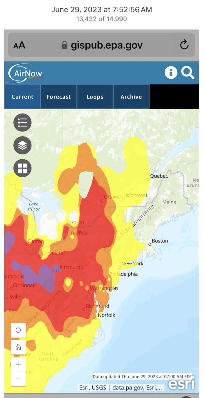
Source: Screen shot by Barbara Crain, CC BY 4.0.
Air pollution from events like the 2023 Canadian wildfires (see Figure 1.3.2) can be shown on maps using the Air Quality Index (AQI). This involves collecting data from ground-based air quality monitoring stations that measure pollutant concentrations such as PM2.5, PM10, ozone, and NO2. The data is then processed and visualized on maps, where different colors represent varying levels of air quality, from good to hazardous. Spatial interpolation techniques, such as kriging or inverse distance weighting, can be used to estimate pollution levels in areas without direct measurements. These AQI maps can also incorporate real-time data from satellite imagery and meteorological information to show the dispersion of pollutants over large areas. By providing a clear visual representation of air quality, these maps help inform the public and guide policy decisions to address pollution and protect public health.

Source: Statistics Canada, “Population density statistics Canada.gif,” July 25, 2024. Reproduced and distributed on an “as is” basis with the permission of Statistics Canada.
A population map of Canada demonstrates the connection between population distribution and geography by highlighting how environmental features and geographic conditions influence where people live. The majority of Canada’s population is concentrated in the southern regions, particularly along the U.S. border, where the climate is milder and more suitable for agriculture and urban development. Major cities like Toronto, Vancouver, and Montreal are situated in these areas, benefiting from access to transportation networks, trade routes, and economic opportunities. In contrast, the northern regions of Canada, characterized by harsher climates, rugged terrain, and limited infrastructure, have significantly lower population densities. These geographic factors shape the population distribution, showing a clear link between the environment and human activities.

Source: “Population Density Map Per Square Kilometre” by English English is Correct via Wikimedia Commons is licensed under CC0 1.0.
In contrast, a smaller-scale map of the world on population density provides only a rudimentary overview of where people live. If you check out Canada on Figure 1.3.4, it appears virtually empty of people and none of the specifics of the close-up map in Figure 1.3.3 are provided. The information derived from a map is very much scale-dependent.
1.3.5 Elements of Maps
Mapping is a way to “write the world” and therefore is a kind of representation. The art and science of creating maps is known as cartography. Cartographic representation, particularly when attempting to depict the 3-D Earth (which is a sphere) on a 2-D surface, inevitably involves distortion.This distortion actually shapes our geographical knowledge of the world and affects our perceptions of place. For example, if you have ever played the board game Risk, where Greenland appears significantly larger than Africa, or grew up with a map of the United States that positioned Hawai’i just off the coast of California, you have encountered such distortions.
Watch the video from SciShow, Can you Make an Accurate Map? [Length 4:33].
Learn more about map projections and distortions in the video below.
One difficulty with map-making, even when using advanced technology, is that the earth is roughly a sphere while maps are generally flat. When converting the spherical Earth to a flat map, some distortion always occurs. A map projection , or a representation of Earth’s surface on a flat plane, always distorts at least one of these four properties: area, shape, distance, and direction. Some maps preserve three of these properties, while significantly distorting another, while other maps seek to minimize overall distortion but distort each property somewhat. So which map projection is best? That depends on the purpose of the map. The Mercator projection , while significantly distorting the size of places near the poles, preserves angles and shapes, making it ideal for navigation (see Figure 1.3.6).

Source: “Mercator projection SW” by Strebe via Wikimedia Commons is licensed under CC BY-SA 3.0.
The Winkel tripel projection is so-named because its creator, Oswald Winkel, sought to minimize three kinds of distortion: area, direction, and distance (see Figure 1.3.7). It has been used by the National Geographic Society since 1998 as the standard projection of world maps.

Source: “Winkel triple projection SW.jpg” by Strebe via Wikimedia Commons is in the public domain in the United States because it was solely created by NASA.

Source: “Map scale – 8km, 5mi.png” by Anna Frodesiak via Wikimedia Commons is licensed under CC0 1.0 Universal.
When representing the Earth on a manageable-sized map, the actual size of location is reduced. Scale is the ratio between the distance between two locations on a map and the corresponding distance on Earth’s surface. A 1:1000 scale map, for example, would mean that 1 meters on the map equals 1000 meters, or 1 kilometer, on Earth’s surface. Scale can sometimes be a confusing concept for students, so it’s important to remember that it refers to a ratio. It doesn’t refer to the size of the map itself, but rather, how zoomed in or out the map is. A 1:1 scale map of your room would be the exact same size of your room – plenty of room for significant detail, but hard to fit into your glove compartment. As with map projections, the “best” scale for a map depends on what it’s used for. If you’re going on a walking tour of a historic town, a 1:5,000 scale map is commonly used. If you’re a geography student looking at a map of the entire world, a 1:50,000,000 scale map would be appropriate. “Large” scale and “small” scale refer to the ratio, not to the size of the landmass on the map. 1 divided by 5,000 is 0.0002, which is a larger number than 1 divided by 50,000,000 (which is 0.00000002). Thus, a 1:5,000 scale map is considered “large” scale while 1:50,000,000 is considered “small” scale.
A legend explains the meaning of the symbols, colors, and styles used to represent geographic data on a map. It includes examples of these symbols paired with descriptive labels. Legend patches typically display points, lines, rectangles, or color gradients that correspond to the symbols on the map.
Labeling maps and adding toponyms (names of places) is also a representative practice that underscores the power inherent in representation. When using a tool like Google Earth, as you zoom in from a global view to a specific area, more toponyms become visible. This occurs because the closer you zoom, the more space is available for text on the map. Therefore, the selection of toponyms is dependent on space and scale. Ultimately, the cartographer decides which places are deemed more important to feature on the map.
These labels assign meaning to the area mapped from the mapmaker’s perspective but do not necessarily reflect the meaning the land has for others. For instance, the names given to natural landmarks on maps often reflect historical, political, or cultural biases of the mapmaker. For example, the renaming of places by colonizers can erase or overshadow indigenous names and their associated cultural significance. In Australia or the Americas, many indigenous names and the stories they carry were replaced by European names during colonization. This re-naming often disregarded the deep connections and traditional knowledge that indigenous communities had with the land. Thus, while maps provide a standardized framework for understanding geography, they can also obscure or omit the rich, diverse meanings that different cultures and communities attribute to the same places.
Colonial era maps often used the label terra nullius, a Latin term meaning no man’s land or empty land. Maps with this label played a role in justifying colonialism, as colonizers used the supposed-reality, as marked on a reliable map, that land was unoccupied and therefore up for grabs. Labels like this ignore and silence the presence of indigenous people and meanings of land.
1.3.6 The Purpose of Maps
All maps have a purpose, whether it’s to guide sailing ships, help students create a more accurate mental map of the world, or tell a story. The map projection, color scheme, scale, and labels are all decisions made by the mapmaker. Some argued that the widespread use of the Mercator projection, which made Africa look smaller relative to North America and Eurasia, led people to minimize the importance of Africa’s political and economic issues. Just as texts can be critiqued for their style, message, and purpose, so too can maps be critiqued for the information and message they present.
Maps have power. Historically, maps were created for and by those with political power. Maps were used to demarcate and claim ownership of land; a means of showing everyone that one has planted their proverbial flag to claim possession. As such, maps have an air of authority and being “official” and “true.” But all maps are made for specific purposes, and can have both accidental and purposeful lies included. The accidental, small white lies of a map have to do most often with the creation of a representation and generalization. Maps have scale and will show a larger geographic area than the size of the paper they are printed upon. Because the map is not at a 1:1 scale as the world, objects must be simplified or generalized in order to not be overly cluttered by the infinite complexity of the world. What is shown, and just as importantly not shown, are choices made by the cartographer. A map might show the locations of important socioeconomic features, like schools and mines, but not show features like landfills or prisons.
1.3.7 Types of Maps
1.3.7.1 Reference Maps
General reference (or general purpose) maps are those that show important physical or cultural features in an area. The primary purpose of a reference map is to deliver location information to the map user. Geographic features and map elements on a reference map tend to be treated and represented equally. In other words, no aspect of a reference map takes precedence over any other part. Moreover, reference maps illustrate geographic reality accurately. Standard reference maps include topographic maps such as those created by the United States Geological Survey (USGS) and image maps obtained from satellites or aircraft that are available through online mapping services.
Source: “Winkel triple projection SW.jpg” by Strebe via Wikimedia Commons is in the public domain in the United States because it was solely created by NASA
The accuracy of a given reference map is indeed critical to many users. For instance, local governments need accurate reference maps for land use, zoning, and tax purposes. National governments need accurate reference maps for political, infrastructure, and military purposes. People who depend on navigation devices like global positioning systems (GPS) units also need accurate and up-to-date reference maps to reach their desired destinations.
1.3.7.2 Thematic Maps
Thematic maps are those that show information about a particular topic. Thematic maps use qualitative and quantitative data to show spatial patterns. While reference maps emphasize the location of geographic features, thematic maps are more concerned with how things are distributed across space. Such things are often abstract concepts such as life expectancy worldwide, per capita gross domestic product (GDP) in Europe, or literacy rates across India. One of the strengths of mapping, particularly thematic mapping, is that it can make such abstract and invisible concepts visible and comparable on a map.
It is important to note that reference and thematic maps are not mutually exclusive. In other words, thematic maps often contain and combine geographical reference information, and conversely, reference maps may contain thematic details. Moreover, when used in conjunction, thematic and reference maps often complement each other.
For example, public health officials in a city may be interested in providing residents equal access to emergency rooms. Insights into this and related questions can be obtained through visual comparisons of a reference map showing emergency room locations across the city to thematic maps of various population segments (e.g., households below poverty, percent elderly, underrepresented groups).
Thematic maps are more abstract, involve more processing and interpretation of data, and often depict concepts that are not directly visible; examples include maps of income, health, climate, or ecological diversity. There is no clear-cut line between reference and thematic maps. Still, the categories are helpful to recognize because they relate directly to how the maps are intended to be used and to decisions that their cartographers have made in shrinking and abstracting aspects of the world to generate the map. Different types of thematic maps include:
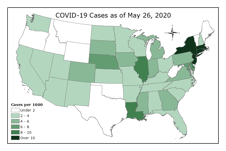
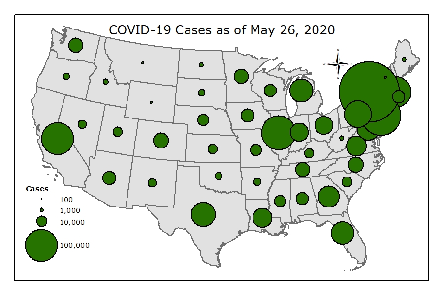
- choropleth – a thematic map that uses tones or colors to represent spatial data as average values per unit area
- proportional symbol – uses symbols of different sizes to represent data associated with other regions or locations within the map
- isopleth– also known as contour maps or isopleth maps depict smooth continuous phenomena such as precipitation or elevation
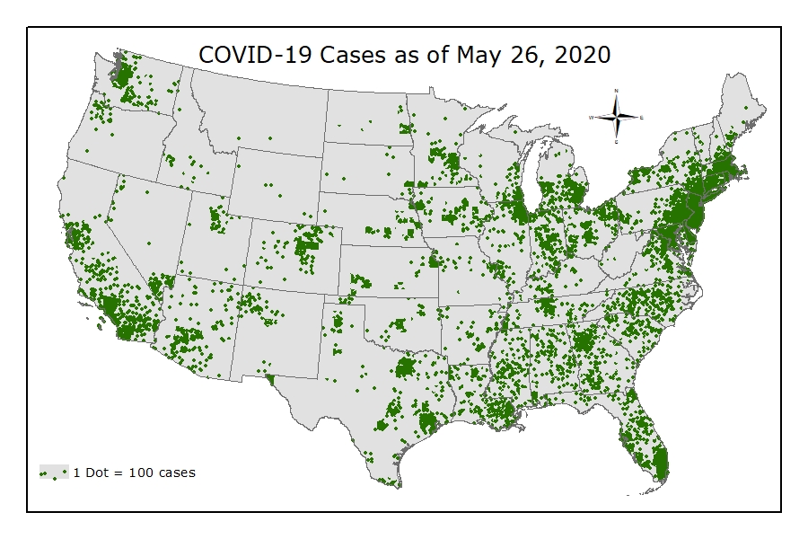
- dot density – uses a dot symbol to show the presence of a feature or phenomenon – dot maps rely on a visual scatter to offer a spatial pattern
- dasymetric – an alternative to a choropleth map, but instead of mapping the data so that the region appears uniform, ancillary information is used to model the internal distribution of the data.
Examples of Thematic Maps
The following maps show four types of thematic maps using the same data. Click the images to enlarge them.
 |
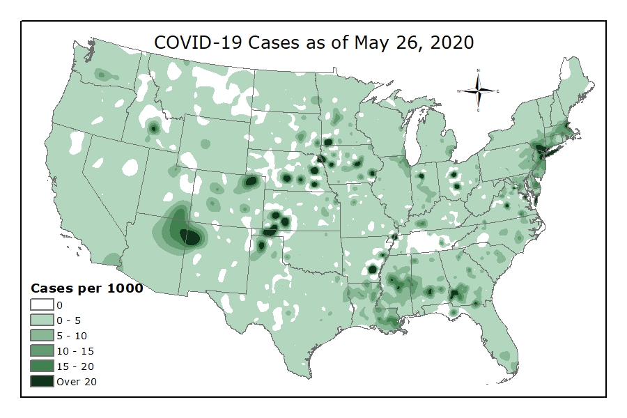 |
| Choropleth map; shows values through color/tint/shading existing political/administrative units. Commonly values are classed together to reduce the complexity of color or symbol. | Isoline map; shows values through connecting lines of equality. The layer of data is a surface; akin to terrain or elevation. This example adds colors between the lines. |
 |
 |
| Dot density map; shows counts of phenomenon as represented by dots. Dots represent 1 or more units, and where dots cluster there are more of the phenomenon. | Proportional or graduated symbols map; shows values in areal units through differently sized symbols. Proportional symbols size symbols proportional to value, while graduated symbols create classes of values. |
(Data from Census Bureau and the Centers for Disease Control and Prevention; maps by Christine Rosenfeld and Nathan Burtch is licensed under CC BY 4.0.)
Both reference and thematic maps are static or fixed representations of reality when presented in hardcopy format. Such permanence on the page suggests that geography and the things we map are also fixed or constant in many ways. This is far from the truth. Integrating GIS with other information technologies like the Internet and mobile telecommunications rapidly changes this view of maps, mapping, and geography.
1.3.7.3 Dynamic Maps
The diffusion of GIS and the popularity of online mapping tools and applications speak to this shift in thinking about maps and map use. In this regard, discussing the diffusion of dynamic maps is worthwhile. Dynamic maps are simply changeable or interactive representations of the Earth. Dynamic mapping refers more to how maps are used and delivered to the map user today (e.g., online, via mobile phone) than to the map’s content. Both reference and thematic maps can be dynamic and integral to any GIS. The critical point about dynamic maps is that more and more people, not just GIS professionals, have access to such maps.
Unlike a hardcopy map with features and elements users cannot modify or change, dynamic maps encourage and sometimes require user interaction. Such interaction can include changing the scale or visible area by zooming in or out, selecting which features or layers to include or remove from a map (e.g., roads, imagery), or even starting and stopping a map animation.
Just as dynamic maps will continue to evolve and require more user interaction in the future, map users will demand more interactive map features and controls. As this democratization of maps continues, map users’ geographic awareness and appreciation will also increase. Therefore, it is critical to understand maps’ nature, form, and content to support map users’ future needs, demands, and expectations.
1.3.7.4 Topographic Maps
Maps are used to display both the cultural and physical features of the environment. Standard topographic maps show various information, including roads, land-use classification, elevation, rivers and other water bodies, political boundaries, and the identification of houses and different types of buildings. Some maps are created with particular goals and an intended purpose.
Most maps allow us to specify the location of points on the Earth’s surface using a coordinate system. This coordinate system can use simple geometric relationships between the perpendicular axes on a grid system for a two-dimensional map to define spatial location. Two types of coordinate systems are currently used in geography: the geographical coordinate system and the rectangular (Cartesian) coordinate system.
1.3.8 Geographic Information Science (GIScience)
Have you ever found driving directions and maps online, used a smartphone to ‘check in’ to your favorite restaurant, or entered a town name or zip code to retrieve the local weather forecast? Every time you and millions of other users perform these tasks, you use Geographic Information Science (GIScience) and related spatial technologies. Many of these technologies, such as Global Positioning Systems (GPS) and in-vehicle navigation units, are very well-known, and you can recall the last time you used them.
Other applications and services that are the products of GIScience are a little less obvious, but they are every bit as standard. If you are connected to the Internet, you are using geospatial technologies. Every time your browser requests a web page from a Content Delivery Network (CDN), a geographic lookup occurs, and the server you are connected to contacts other servers closest to it and retrieves the information. This happens so that the delay between your request to view the data and the data sent to you is as short as possible.
GIScience and related technologies are everywhere, and we use them daily. When it comes to information, “spatial is special.” Reliance on spatial attributes separates geographic information from other types of information. There are several distinguishing properties of geographic information. Understanding them and their implications for the practice of geographic information science is critical to utilizing geographic data.
- Geographic data represent spatial locations and non-spatial attributes measured at certain times.
- Geographic space is continuous.
- Geographic space is nearly spherical.
- Geographic data tend to be spatially dependent.
Spatial attributes tell us where or where things were when the data were collected. By merely including spatial details, geographic data allows us to ask many geographic questions. Another essential characteristic of geographic space is that it is “continuous.” Although the Earth has valleys, canyons, caves, oceans, and more, there are no places on Earth without a location, and connections exist from one place to another. Outside of science fiction, there are no tears in the fabric of space-time. Modern technology can measure location precisely, making it possible to generate incredibly detailed depictions of geographic feature locations (e.g., of the coastline of the eastern U.S.). It is often possible to measure so precisely that we collect more location data than we can store and much more than is useful for practical applications. How much information is helpful to store or display on a map will depend on the map scale (how much of the world we represent within a fixed display, such as the size of your computer screen) and on the map’s purpose. The map below is a digital elevation model (DEM), considered continuous because elevation always exists on the planet.
In addition to being continuous, geographic data tend to be spatially dependent. More simply, “everything is related to everything else, but near things are more related than distant things” (which leads to an expectation that things near one another tend to be more alike than far apart). How alike things are in their proximity to other items can be measured by a statistical calculation known as spatial autocorrelation. Without this fundamental property, geographic information science as we know it today would not be possible.
Geographic data come in many types from many different sources and are captured using many techniques; they are collected, sold, and distributed by a wide array of public and private entities. In general, we can divide the collection of geographic data into two main types:
- Directly collected data
- Remotely sensed data
Directly collected data are generated at the source of the phenomena being measured. Examples of directly collected data include temperature readings at specific weather stations, elevations recorded by visiting the location of interest, or the position of a grizzly bear equipped with a GPS-enabled collar. Also included here are data derived from surveys (e.g., the census) or observations (e.g., Audubon Christmas bird count).
Remotely sensed data are measured from remote distances without direct contact with the phenomena or the need to visit the locations of interest. Satellite images, sonar readings, and radar are all remotely sensed data.
Maps are the raw material and the product of geographic information systems (GIS). All maps represent features and characteristics of locations, and that representation depends upon data relevant at a particular time. All maps are selective; they do not show us everything about the place depicted; they only show the specific features and characteristics their maker decided to include. Maps are often categorized into reference or thematic maps based on the producer’s decision about what to have and the expectations about how the map will be used. The prototypical reference map depicts the location of “things” that are usually visible worldwide; examples include road maps and topographic maps showing terrain.
