
Chapter 2: Population and Health
2.6 The Geography Of Health
Source: “Goal 3 Logo” from the Sustainable Development Goals – Good health and well-being.
This chapter addresses some of the issues outlined in the United Nations’ Sustainable Development Goal #3: Good Health and Well-being. The goal promotes “Ensure healthy lives and promote well-being for all at all ages”. Some of the associated targets aim to reduce the global maternal mortality ratio, eliminate preventable deaths of newborns and children, and eradicate epidemics of communicable diseases. such as AIDS, tuberculosis, malaria, to name a few.
The geography of health or medical geography is the study sickness or health across space. Sickness can throw off population projections or potentially change a population’s size in a short period of time.
Please click the play button at the bottom of the diagram (Figure 2.6.2) to see how the leading causes of deaths in the world changed between 1990 and 2021.
The same way that societies tend to pass through the stages of demographic transition, they also tend to pass through an epidemiological transition. The demographic transition and epidemiological transition are somewhat related. The improvements in food supply and better sanitation that lead to larger populations also lead to healthier populations. They are not exactly the same thing however. Epidemiology is the study of diseases themselves and the way that they function. The epidemiological transition is a way of representing the relationship between development and disease. In less developed places, U5MR – the Under-5-Mortality Rate – is high and infectious disease, particularly Malaria, is the greatest threat. In higher income societies, the health threats tend to be chronic afflictions- cancer, diabetes, or heart disease.

Source: “Leading Cause of Death in High-Income Countries” retrieved from World Health Organization (WHO)

Source: “Leading Causes of Low Income Countries” retrieved from World Health Organization (WHO)
TASK
Compare the leading causes of death in high-income versus low-income countries.What may they tell us about their medical infrastructure and their impacts on their populations’ life expectancy?
Morbidity refers to sickness and mortality refers to death. We can look at different rates of mortality and morbidity to gain some insight into the health of a population. Even at the scale of a single country, the U.S. specifically, or at the scale of a state, we can see health disparities and clear differences in morbidity rates and mortality rates. Specifically, the Virginia map Figure 2. below shows how chronic disease prevalence indicators for health districts in Virginia vary across the counties.
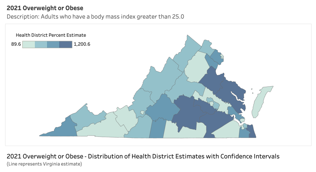
Source: “Overweight or Obese” retrieved from Virginia Department of Health – Chronic Disease Map by District.
The map on Cancer Mortality Rates 2016-2020 varies across counties with different levels of median household incomes (see map below) and thus health insurance.
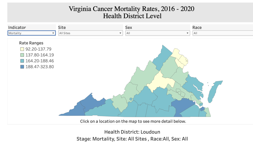
Source: “Virginia Cancer Mortality 2016-2020” retrieved from Virginia Department of Health – Cancer Incidence and Mortality in Virginia.

Source: “Household Income in VA by County” | HDPulse: An Ecosystem of Minority Health and Health Disparities Resources. National Institute on Minority Health and Health Disparities. Created 8/20/2024. Available from https://hdpulse.nimhd.nih.gov
Diabetes was once related to higher income countries but as more and more countries increase their income so does the obesity rate of their citizens. As obesity becomes a greater problem, so does diabetes. On the other hand, malaria is a disease of countries with less income, usually in tropical or subtropical areas, but as the global climate shifts so do the mosquitoes that carry that pathogen. Incidences in Germany convinced many Germans to retrofit their houses with screened windows.
An alternative approach to assessing the health status of a country or region is through the measurement of the infant mortality rate. As defined by the CIA World Factbook, this metric quantifies the number of deaths of infants under one year old per 1,000 live births within a given year. Comparing the infant mortality rates of the United States with those of other nations serves as a critical indicator of our nation’s overall health, highlighting areas for improvement and the potential to foster healthier communities. The list below compares some OECD countries (members of which are listed here) using three health measures: infant mortality, life expectancy at birth and total health spending. Check America’s Health Rankings 2021 Annual Report – International Comparison for a graphic display. The U.S. had a higher infant mortality rate and lower life expectancy than most other OECD member countries.
Even top U.S. states ranked poorly among member countries for the infant mortality and life expectancy measures, despite the U.S. having the highest total health spending of all OECD countries. At 5.7 deaths per 1,000 live births, the U.S. ranked No. 33 out of the 38 OECD countries in 2019. Iceland (No. 1) had the lowest rate in 2019 with 1.1 deaths per 1,000 live births. Mexico (No. 37) and Columbia (No. 38) had the highest infant mortality rates of OECD countries at 13.1 and 17.3 deaths per 1,000 live births, respectively.
Massachusetts and New Hampshire were the states with the lowest infant mortality rates both at 3.9 deaths per 1,000 live births in 2019, placing them on par with France and Poland (tied for No. 27). The state with the highest rate, Mississippi, had an infant mortality rate of 8.6 deaths per 1,000 live births, which was twice the OECD average.

Source: “2022 Infant Mortality Rates by State” retrieved from CDC – National Center for Health Statistics
Life expectancy is tied to a country’s level of health as well and as such life expectancy at birth is a common and important long-term population health indicator. It describes how long a newborn can expect to live, on average, if current death rates remain the same. The average life expectancy in OECD countries was 81.0 years in 2019. In 2019 The U.S. life expectancy at birth was 78.9 years and ranked No. 29 out of the 38 OECD countries, falling between the Czech Republic (79.3 years, No. 28) and Estonia (78.8 years, No. 30). However, many countries including the USA experienced outright drops in life expectancy during the pandemic; it was recorded at 76.5 in 2021 in the US. COVID-19 deaths and drug overdoses have been cited as the causes. In 2024 the life expectancy has been increasing to 77.5 according to the CDC Data Briefs – Mortality in the United States 2022.
, Life expectancy at birth (indicator). doi: 10.1787/27e0fc9d-en (Accessed on 10 June 2024)")
Source: “Life Expectancy at birth in OECD countries, 2022” retrieved from Organisation for Economic Co-operation and Development.
Due to the work of numerous organizations, a number of diseases in many parts of the world have been reduced and some have been eradicated. Smallpox no longer exists in the wild and Dracunculiasis (Guinea worm) has gone from millions of cases thirty years ago to single digits in recent years. Other diseases have been dramatically reduced. Polio once infected millions of people per year across the world, but through vaccination programs, its range has been reduced to just two countries.
There is now even a category of diseases known as re-emerging diseases. These are diseases that were previously thought to be eradicable but are now returning to populations that had previously been largely free of them. Re-emerging diseases are diseases like tuberculosis and diphtheria that had been declining for decades that have begun to increase in prevalence.
