
Chapter 11: Economy and Development
11.3 The Geography of Economics – HDI
The Industrial Revolution, which prompted the shift in population from rural to urban, also encouraged market economies, which have evolved into modern consumer societies. Various theories and models have been developed over the years to help explain these changes.
In the 1960s, economist Walt Rostow produced a demographic transition model to outline a pattern of economic development that has become one model for growth in a global economy. Rostow’s model (Figure 11.3.1) outlined the five stages of growth in the economic modernization of a country:
Stage 1: Traditional society
Stage 2: Preconditions for take-off
Stage 3: Take-off
Stage 4: Drive to maturity
Stage 5: Age of high mass consumption
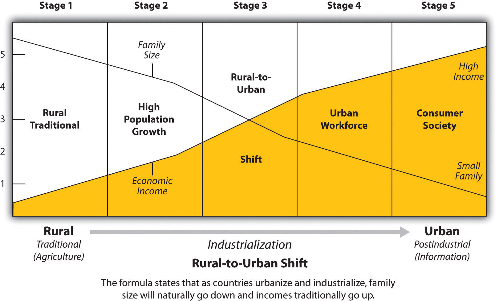
Source: “Figure 1.37 Index of Economic Development” by Dr. Royal Berglee via Saylor Academy is licensed under CC BY-NC-SA 3.0.
Globally, the world shifted towards an urbanized world in 2008 when it was estimated that 50% of the world’s population lived in rural, and 50% in urban areas. Potentially, this fact gives rise to greater economic growth world-wide with disparities between and within countries.
In order to measure economic growth but also human well-being, the UN created the Human Development Index (HDI) in 1990. It is used by the United Nations Development Program to measure a standard of human development, which refers to the widening opportunities available to individuals for , health care, education, income, and employment. The HDI incorporates variables such as standards of living, literacy rate, and life expectancy to indicate a measure of well-being or the quality of life for a specific country. Each country gets an overall HDI score based on combining the three factors with the highest possible being 1.0 (=100%).
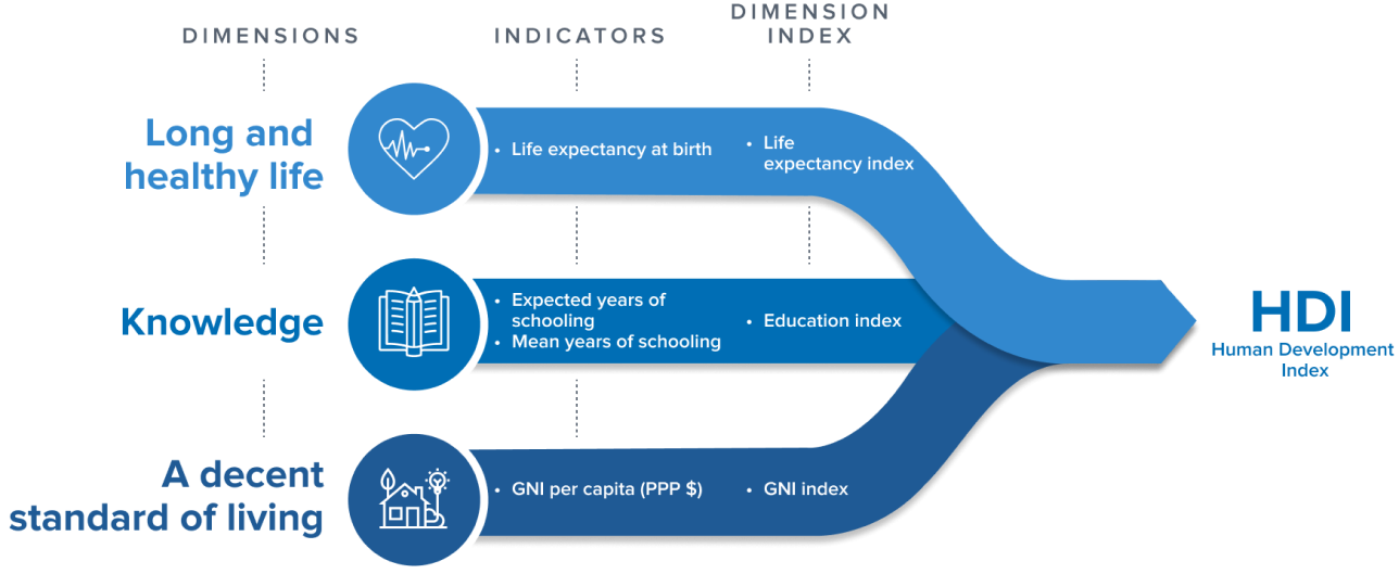
Source: “HDI Dimensions and Indicators” by Human Development Index (HDI) of United Nations Development Programme.
Check this map and compare how countries are doing on the large-scale.
The dimensions of HDI are measured with indicators: a long and healthy life is measured by life expectancy at birth, good education (knowledge) is measured by two indicators, expected and mean years of schooling; and a decent standard of living is measured by Gross National Income (GNI) per capita, logarithmized to reflect that incomes become less important as they increase.
11.3.1 A Long and Healthy Life
Good health is fundamental for a high quality of life, as it influences our ability to enjoy life and participate in daily activities. Historical trends indicate substantial increases in global life expectancy over the past two centuries, highlighting worldwide advancements. According to our World in Data, life expectancy has doubled in the last two centuries. Look at the map below and click on it for a closer look:
 - “Twice as long – life expectancy around the world” Published online at OurWorldInData.org. Retrieved from: 'https://ourworldindata.org/life-expectancy-globally' [Online Resource]")
Source: “Life expectancy in 1800, 1950, and 2015” by Max Roser via Our Wold in Data is licensed under CC BY.
Questions one may want to ask are: Why did the United States fall behind most Western European states in terms of life expectancy? What happened between 1950 and 2015 for the life expectancy in the US to fall behind?
Access to health care mirrors literacy statistics globally (see below), meaning that the world has seen tremendous improvement. EVERYWHERE.
However, geographers always want to look at this issues from a different scale to understand if the patterns at a global scale as seen above hold true at a regional or national scale. Figure 11.3.5 is a good example of a geographer peeling back those layers of data. According to the 2019 map below many people under 65 in Texas, Florida and elsewhere in the Midwest, the American South and High Plains lacked health insurance and thus would avoid going to a physician. This map might be part of the answer why the United States is not the leader in life expectancy anymore even though expenditures for health care are the highest in the world (check Figure 11.3.6).
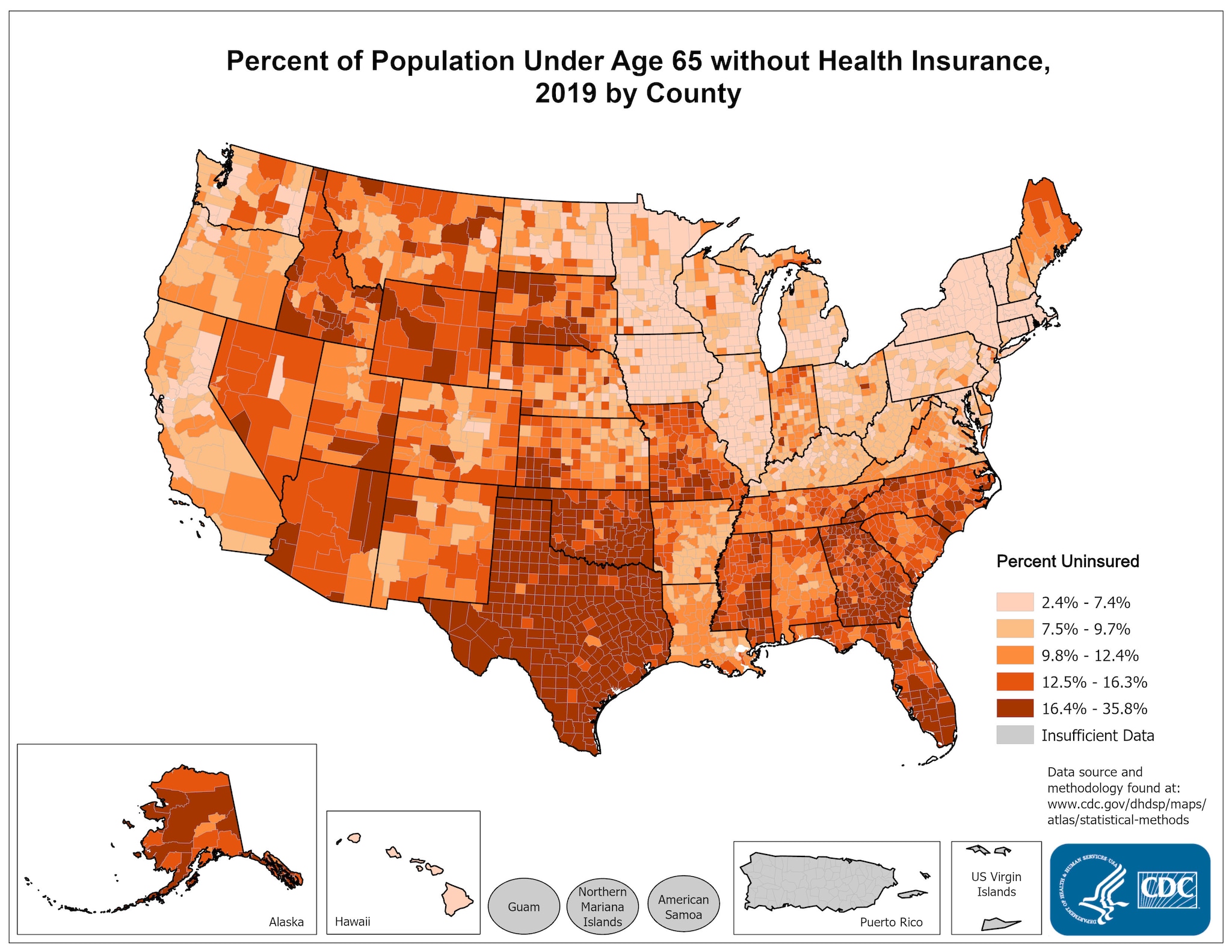
Source: “Health Care Maps—Health Insurance” by National Center for Chronic Disease Prevention and Health Promotion, Division for Heart Disease and Stroke Prevention, CDC.

Source: “OECD health expenditure per capita by country” by Yuasan via Wikimedia Commons is licensed under CC0 1.0.
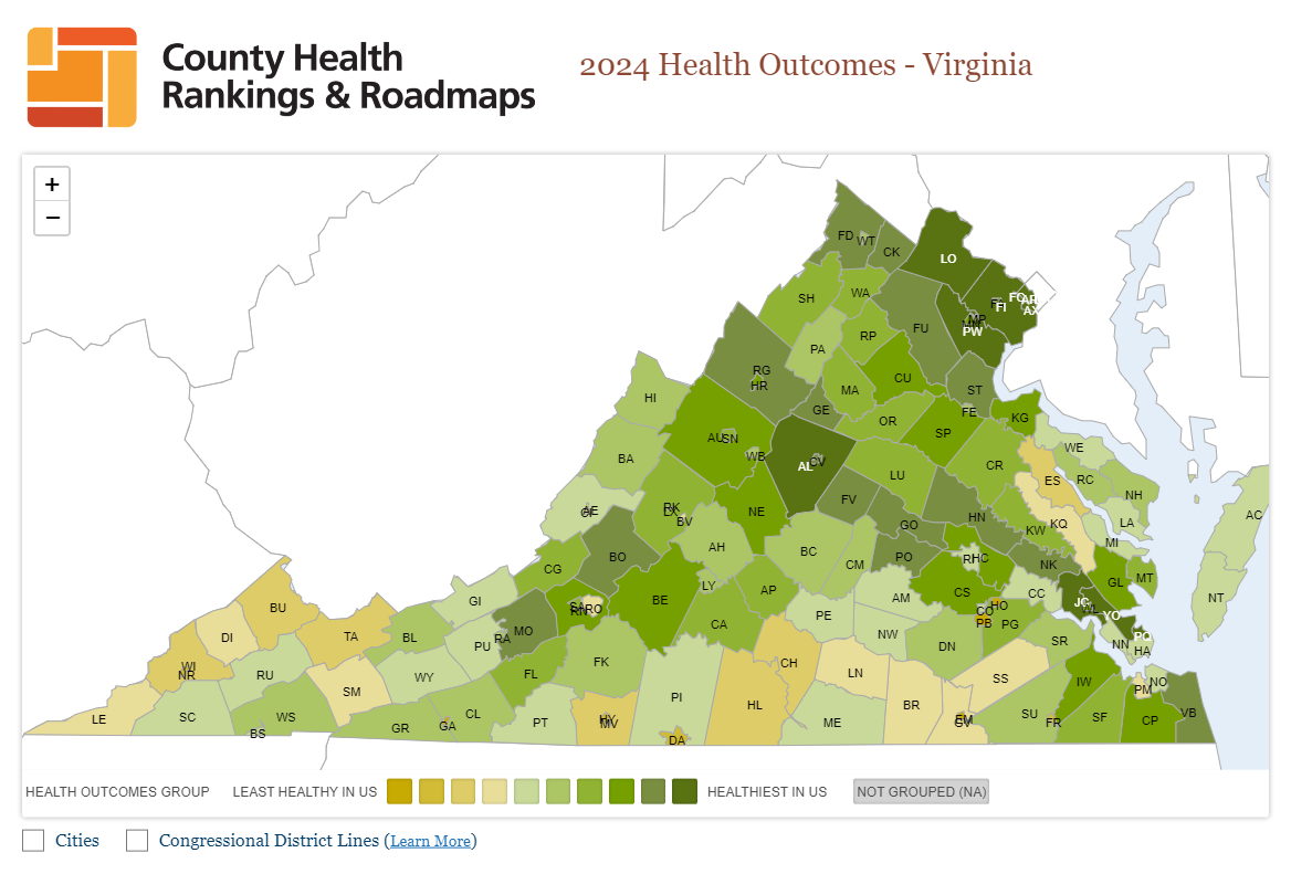
“2024 Virginia Health Outcomes Map” by University of Wisconsin Population Health Institute. County Health Rankings & Roadmaps 2024. www.countyhealthrankings.org.
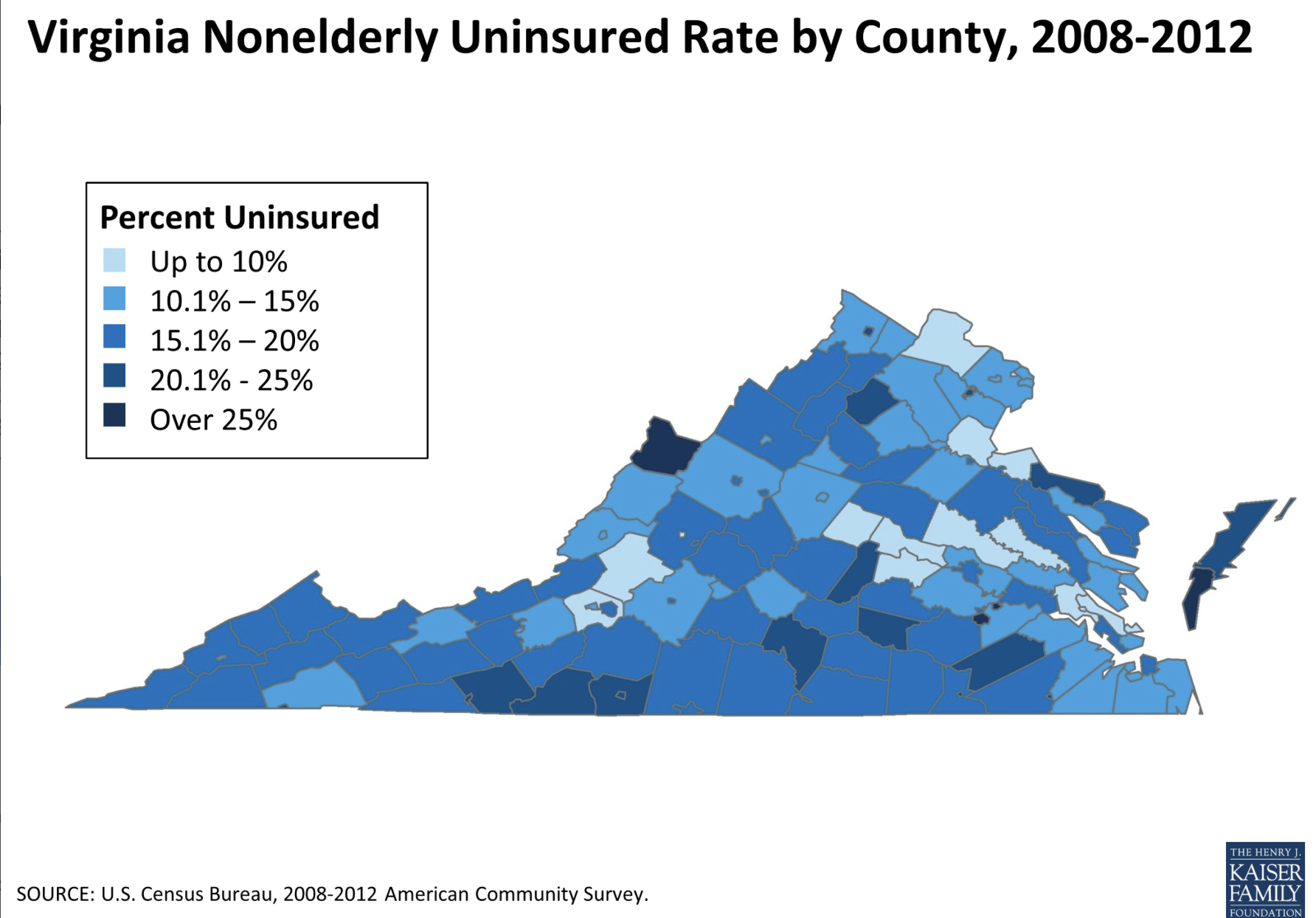
“Figure 12: Virginia Nonelderly Uninsured Rate by County, 2008-2012” by The Henry J. Kaiser Family Foundation.
If we compare the two maps above, i.e. Figures 11.3.7 and 11.3.8, we can see somewhat of a correlation between areas where people tend to be uninsured and areas with least health ranking. However, it should be noted that the lower map is from 2012 and there were a lot of positive changes in the interim in the number of insured people. Unfortunately a more recent map was unavailable.

Source: “Virginia Free Clinics: A Lifesaving Investment” by Virginia Association of Free and Charitable Clinics.
The existence of an extensive Free Clinic system within Virginia leads one to realize that there are also great disparities on the county and community levels. It is interesting to note that not all counties with relatively poor health outcome have a free clinic. Rather, it appears, that the richest counties (Loudoun and Fairfax and others) have also quite a few free clinics pointing to disparities.
Healthcare spending per capita in the US is significantly higher than in other high-income countries due to several key factors. Medical services, prescription drugs, and administrative costs are all much higher in the US because there is little regulation to control prices. The absence of universal healthcare leads to inefficiencies and disparities in how costs are managed. Additionally, the US healthcare system often focuses on advanced technologies and specialized treatments, which tend to be more expensive. The high prevalence of chronic diseases and a fee-for-service model, which incentivizes more frequent use of healthcare services, further drive up overall spending.
11.3.2 Knowledge
Countries with higher income also can invest more money and resources because of their economies. Thus their people tend to be more educated and healthier; children are more likely to survive, and adults tend to live longer than those in countries with less income. Education and healthcare are likely the two most crucial components for improving a nation’s development status.There is a direct correlation to development and education: the more developed a nation, the more educated the population. Thus, one of the best indicators of a nation’s level of development is its literacy rate, the percent of people who can read or write.
To see the map more clearly and to be able to toggle between the years of 1990 and 2022 please click Literacy By Max Roser and Esteban Ortiz-Ospina, Our World in Data. .
Figure 11.3.10 Literacy rate, 2022
Source: Max Roser and Esteban Ortiz-Ospina (2024) – “Literacy rate, 2022”. Published online at OurWorldInData.org. Retrieved from: ‘https://ourworldindata.org/literacy’ [Online Resource]
Source: Max Roser and Esteban Ortiz-Ospina (2024) – “Literacy and illiterate world population”. Published online at OurWorldInData.org. Retrieved from: ‘https://ourworldindata.org/literacy’ [Online Resource]
In the highest income countries, the literacy rate is usually around 98 percent, whereas countries with the lowest income show the literacy rate to be around 60 percent with males being more literate than he females.. A lot of progress has been made in this regard, however.
11.3.3 A Decent Standard of Living
One of the key achievements of the human development approach has been to increase recognition that monetary measures like GDP per capita are insufficient for representing development. The Human Development Index (HDI) provides a more comprehensive measure by combining a nation’s longevity, education, and income into a simple unweighted average, and it is widely accepted in development discourse. Over time, the HDI has been refined and modified, driven by critiques and concerns from various quarters. These critiques have also led to the creation of companion indices that provide a broader and more nuanced picture of global human development.
The HDI emphasizes that people and their capabilities should be the ultimate criteria for assessing the development of a country, not economic growth alone. The HDI can also be used to question national policy choices, asking how two countries with the same level of GNI per capita can end up with different human development outcomes. These contrasts can stimulate debate about government policy priorities.
To be able to toggle between the years of 1990 and 2022 please click on the map.
By comparing the two maps above you can see that Figure 11.3.13 is much less differentiated than Figure 11.3.12. For example, it lumps China together with Russia or many African states and India whereas the country appears better situated in Figure 11.3.12.
In general, jobs can be classified into three major (!) types of sectors, which greatly influence the economics, standards of living, trade, and even social classes within a society. The primary sector represents jobs directly related to the extraction of the Earth’s natural resources (e.g., forestry, raw materials, or agriculture). In the secondary sector, jobs are focused on manufacturing raw materials from the primary sector to usable products. The tertiary sector provides goods and services to people in exchange for payment. These types of jobs include lawyers, doctors, educators, banking, retail, athletes, and others. The tertiary sector is often extended into two more sectors: the quaternary and quinary sectors. The quaternary sector refers to activities that involve the creation and distribution of knowledge and information and the quinary sector is reserved for the highest level of economic activity, which involves the decision-making and policy-making that drives the other sectors of the economy.

Source: “Economic sectors and income” by Rcragun via Wikimedia Commons is licensed under CC BY-SA 3.0.
It is probably apparent that the majority of the jobs in countries with higher income are tertiary. There are primary and secondary sector jobs in countries like the United States, but the driving economic force is in the tertiary sector including the quaternary and quinary sectors. Higher income countries are also more productive[1] than countries with less income, not because they work harder, but because of access and use of technology.

Source: “The State of Unemployment in Europe” by Anna Fleck via Statista is licensed under CC BY-SA.
However, the global map showing the HDI is still rather undifferentiated – let us look at Europe, for example. At this scale, a geographer might think that a country like Spain, with a strong GDI, also has a healthy economy. However, Spain has faced challenges in recovering from the global recession of 2008 and the influx of large African migrant groups, resulting in persistent pockets of chronic unemployment across the country. In Figure 11.3.15 the same can be seen to a lesser extent in Greece and Italy.

Source: “Map with the unemployment rate in Spain by regions updated to January 2022 data” by Jialxv via Wikimedia Commons is licensed under CC BY-SA 4.0.
Now, we should look at a more regional scale and we are able to see that southern Spain is the area with greatest unemployment. One leading cause is an economy based mostly on tourism and building sectors, as well as lack of industry. The exception is Basque Country in the north which is the most industrialized region in the country. Knowing this we could ask questions that will further our investigation such as ‘What kinds of education levels exist among people in those areas?’ ‘What kinds of social services, if any, are needed in those areas?’ This type of questioning can help to understand patterns of social and economic development and influence public policy.
- In economics, productivity is the value of a product compared to the amount of labor. ↵
