
16 Javanotes 9.0, Section 6.4 — Basic Controls
Section 6.4
Basic Controls
In preceding sections, you’ve seen how to use a
graphics context to draw on the screen and how to handle mouse events and
keyboard events. In one sense, that’s all there is to GUI programming. If
you’re willing to program all the drawing and handle all the mouse and keyboard
events, you have nothing more to learn. However, you would either be doing a
lot more work than you need to do, or you would be limiting yourself to very
simple user interfaces. A typical user interface uses standard GUI components
such as buttons, scroll bars, text-input boxes, and menus. These components
have already been written for you, so you don’t have to duplicate the work
involved in developing them. They know how to draw themselves, and they can
handle the details of processing the mouse and keyboard events that concern
them.
Consider one of the simplest user interface components, a push button. The
button has a border, and it displays some text. This text can be changed.
Sometimes the button is disabled, so that clicking on it doesn’t have any
effect. When it is disabled, its appearance changes. When the user clicks on
the button, it changes appearance when the mouse button is
pressed and changes back when the mouse button is released. In fact, it’s more
complicated than that. If the user moves the mouse outside the push button
before releasing the mouse button, the button changes to its regular
appearance, and releasing the mouse at that time will not trigger the button.
To implement this, it is necessary to respond to mouse exit or
mouse drag events. Furthermore, on many platforms, a button can receive the
input focus. The button changes appearance when it has the focus. If the button
has the focus and the user presses the space bar, the button is triggered. This
means that the button must respond to keyboard and focus events as well.
Fortunately, you don’t have to program any of this, provided you
use an object belonging to the standard class javafx.scene.control.Button. A
Button object draws itself and processes mouse, keyboard, and focus
events on its own. You only hear from the Button when the user
triggers it by clicking on it or pressing the space bar while the button has
the input focus. When this happens, the Button object creates an
event object belonging to the class javafx.event.ActionEvent. The
event object is sent to any registered listener to tell it that the button
has been pushed. Your program gets only the information it needs—the fact
that a button was pushed.
Many standard components that are defined as part of the JavaFX graphical user interface
API are defined by subclasses of the class Control, from
package javafx.scene.control. Controls (with just a couple of exceptions)
can be manipulated by the user to generate input and events for the program.
A number of useful methods are defined for controls. I begin by mentioning
three methods that can be used with any Control
control:
-
control.setDisable(true) can be called to
disable the control. The control can be re-enabled with control.setDisable(false).
When a control is disabled, its appearance
might change, and it cannot be the target of mouse or key events.
This function can actually be called with any scene graph node, not just controls;
when you disable a node, any nodes contained inside that node are also disabled.
There is a boolean-valued function, control.isDisabled()
that you can call to discover whether the control is disabled, either because
it was explicitly disabled or because it is inside a container node
that was explicitly disabled. -
control.setTooltip(new Tooltip(string)) sets the
specified string as a “tool tip” for the control. The tool tip is displayed
if the mouse cursor is inside the control and the mouse is not moved for a few
seconds. The tool tip should give some information about the meaning of the
control or how to use it. -
control.setStyle(cssString) sets the CSS style
of the control. CSS was discussed in Subsection 6.2.5.
Note that using a control, or any scene graph node,
is a multi-step process. The component object must be created
with a constructor. It must be added to a container. In many cases, a listener
must be registered to respond to events from the component. And in some cases,
a reference to the component must be saved in an instance variable so that the
component can be manipulated by the program after it has been created.
In this section, we will look at a few of the basic standard control components that are
available in JavaFX. They are all defined by classes in the package
javafx.scene.control. In the next section
we will consider the problem of laying out components in containers.
6.4.1 ImageView
But before we turn to controls, I want to mention one other node type:
ImageView from package javafx.scene.image.
Recall from Subsection 6.2.3 that an Image
object represents a picture, and that images can be loaded from resource files.
An Image can be drawn on a Canvas,
but an Image is not a Node.
That is, it can’t be part of a scene graph.
An ImageView is a scene graph node that is a
simple wrapper for an image. Its purpose is simply to display the
image. It makes it possible to add the image to a scene graph without
having to draw the image on a canvas. The image can be specified as a parameter to the
ImageView constructor. For example, suppose
that “icons/tux.png” is the path to an image resource file.
Then an ImageView can be created to display
the image like this:
Image tux = new Image("icons/tux.png");
ImageView tuxIcon = new ImageView( tux );
In this case, I am thinking of the image as an “icon,” that is, a small
image that is typically used on a button, label, or menu item to
add a graphical element to the usual plain text. In fact, we’ll see that
you can do exactly that in JavaFX.
6.4.2 Label and Button
The first four controls that we will look at have something in common:
They all display a string of text to the user, which the user can view
but not edit. Furthermore they can all display a graphical element in
addition to or instead of the text. The graphic can be any Node
but is usually a small icon, implemented as an object of type ImageView.
In fact, all four types of controls inherit their behavior from a common
superclass named Labeled. In Subsection 6.6.2,
we look at menu items, which also inherit from Labeled.
That class defines a number of instance methods that can be used with
labels, buttons, and other labeled controls. Those methods include:
-
setText(string) for
setting the text that is displayed on the control. The text
can be multi-line. The new line character, “\n”, in the string
represents a line break. - setGraphic(node) for setting the control’s graphical element.
- setFont(font) for setting the font that is used for the text.
- setTextFill(color) for setting the paint that is used for drawing the text.
-
setGraphicTextGap(size) for setting the amount of space that is put
between the text and the graphic. The parameter is of type double. -
setContentDisplay(displayCode) for setting where the graphic
should be placed with respect to the text. The parameter is a constant
from an enum, ContentDisplay, such as
ContentDisplay.LEFT, ContentDisplay.RIGHT, ContentDisplay.TOP
or ContentDisplay.BOTTOM.
All of these setter methods have corresponding getters, such as getText()
and getFont(). I have not listed a setter method for the background
color. It is possible to set a background color, but it’s cumbersome. (Setting
the background color of a control, c, to white looks like this:
c.setBackground(new Background(new BackgroundFill(Color.WHITE,null,null)));
where Background and BackgroundFill
are in package javafx.scene.layout.) It is more easily done by
setting the CSS style of the control with the setStyle() method.
CSS is also useful for setting the border and for setting padding (the amount of
empty space left around the content).
A Label is certainly the simplest type of control.
It adds almost nothing to the Labeled class. Its
purpose is simply to display some unedited text and/or a graphic to the user.
The label class has two constructors. The first has one parameter of type
String specifying the text for the label. The
second adds a parameter of type Node specifying
a graphic for the label. For example, assuming that tuxIcon
is the ImageView object from the previous subsection,
Label message = new Label("Hello World");
Label linuxAd = new Label("Choose Linux First!", tuxIcon);
The default background of a label is completely transparent, and the label
has no border or padding by default. Often I would like to add at least
some padding. Here is an example of setting all three properties using CSS:
message.setStyle("-fx-border-color: blue; -fx-border-width: 2px; " +
                           "-fx-background-color: white; -fx-padding: 6px");
You’ve already seen buttons used in Section 6.1.
A Button, like a Label, displays
some text and/or a graphic to the user, and the Button
class, like the Label class, has two constructors:
Button stopButton = new Button("Stop");
Button linuxButton = new Button("Get Linux", tuxIcon);
When the user clicks a button, an event of type ActionEvent
is generated. You can register an event handler for the action with the button’s
setOnAction method. For example,
stopButton.setOnAction( e -> animator.stop() );
In addition to the methods inherited from Labeled, a button
has the instance methods setDisable(boolean) and setToolTip(string)
that were mentioned at the beginning of this section.
The setDisable() and setText() methods are
particularly useful for giving the user information about what is going on in
the program. A disabled button is better than a button that gives an obnoxious
error message such as “Sorry, you can’t click on me now!” For example, suppose
that we want to use two buttons to start and stop an AnimationTimer,
animator. When the animation is running, the start button should be
disabled, and when the animation is paused, the stop button should be disabled.
The code for this might look like:
Button startButton = new Button("Run Animation");
Button stopButton = new Button("Stop Animation");
stopButton.setDisable(true); // Stop button is initially disabled.
startButton.setOnAction( e -> {
    animator.start();
    startButton.setDisable(true);
    stopButton.setDisable(false);
} );
stopButton.setOnAction( e -> {
    animator.stop();
    startButton.setDisable(false);
    stopButton.setDisable(true);
} );
This ensures that the user can’t try to start the animation when it is already
started or stop it when it is already stopped.
Often, there is a button that triggers some default action in a program.
For example, the user might enter data into some text input boxes and then click
a “Compute” button to process the data. It would be nice if the user could just
press Return when done typing, instead of having to click the button.
In JavaFX, you can make a Button, button,
into the default button for the window that contains it by calling
button.setDefaultButton(true);
When a window has a default button, then pressing the Return (or Enter) key on the
keyboard is equivalent to clicking the default button, unless the key event
generated by the Return key is consumed by another component. This
can be very convenient for the user.
6.4.3 CheckBox and RadioButton
A CheckBox is a component that has two states: selected or
unselected. (Being “selected” means that the checkbox is checked.)
The user can change the state of a check box by clicking on it. The
state of a checkbox is represented by a boolean value that is
true if the box is selected and is false if the box is
unselected. A checkbox has a label, which is specified when the box is
constructed:
CheckBox showTime = new CheckBox("Show Current Time");
CheckBox is a subclass of Labeled,
so a checkbox can also have a graphic, and all the instance methods from
the Labeled class can also be used with checkboxes.
(There is no constructor that specifies a graphic for the checkbox; any
graphic has to be set by calling setGraphic(node).)
Usually, it’s the user who sets the state of a CheckBox by
clicking on it, but you can also set the state programmatically. The current state of a checkbox is set
using its setSelected(boolean) method. For example, if you want the
checkbox showTime to be checked, you would say
“showTime.setSelected(true)”. To uncheck the box, say
“showTime.setSelected(false)”. You can determine the current state of
a checkbox by calling its isSelected() method, which returns a boolean
value.
In many cases, you don’t need to worry about events from checkboxes. Your
program can just check the state whenever it needs to know it by calling the
isSelected() method. However, a checkbox does generate an event when
its state is changed by the user, and you can detect this event and respond to it if you want
something to happen at the moment the state changes. When the state of a
checkbox is changed by the user, it generates an event of type
ActionEvent. If you want something to happen when the user changes the
state, you must register a handler with the
checkbox by calling its setOnAction() method. (Note that if you change the state by calling the
setSelected() method, no ActionEvent is generated. However,
there is another method in the CheckBox class, fire(),
which simulates a user click on the checkbox and does generate an
ActionEvent.)
It is actually possible for a checkbox to be in a third state, called
“indeterminate,” although that possibility is turned off by default.
See the API documentation for details.
Closely related to checkboxes are radio buttons.
Like a checkbox, a radio button can be either selected or not. However,
radio buttons are expected to occur in groups, where at most one radio button in a given
group can be selected at any given time. Radio button groups let the user
select one choice among several alternatives. In JavaFX, a radio button is represented
by an object of type RadioButton. When used in isolation, a
RadioButton acts just like a CheckBox,
and it has the same constructor, methods, and events, including methods inherited from Labeled.
Ordinarily, however, a RadioButton is used in a
group. A group of radio buttons is represented by an object belonging to the
class ToggleGroup. A ToggleGroup is not a component
and does not itself have a visible representation on the screen. A
ToggleGroup works behind the scenes to organize a group of radio
buttons, to ensure that at most one button in the group can be selected at any given
time.
To use a group of radio buttons, you must create a RadioButton
object for each button in the group, and you must create one object of type
ToggleGroup to organize the individual buttons into a group. Each
RadioButton must be added individually to the scene graph, so that it
will appear on the screen. (A ToggleGroup plays no role in the
placement of the buttons on the screen.) Each RadioButton must also
be added to the ToggleGroup. You do that by calling
the radio button’s setToggleGroup(group) instance method.
If you want one of the buttons to be selected initially, you
can call setSelected(true) for that button. If you don’t do this, then
none of the buttons will be selected until the user clicks on one of them.
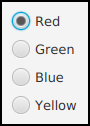
As an example, here is how you could set up a group of radio buttons that can
be used to select a color:
RadioButton redRadio, blueRadio, greenRadio, yellowRadio;
         // Variables to represent the radio buttons.
         // These might be instance variables, so that
         // they can be used throughout the program.

ToggleGroup colorGroup = new ToggleGroup();

redRadio = new RadioButton("Red");   // Create a button.
redRadio.setToggleGroup(colorGroup); // Add it to the ToggleGroup.

blueRadio = new RadioButton("Blue");
blueRadio.setToggleGroup(colorGroup);

greenRadio = new RadioButton("Green");
greenRadio.setToggleGroup(colorGroup);

yellowRadio = new RadioButton("Yellow");
yellowRadio.setToggleGroup(colorGroup);

redRadio.setSelected(true);  // Make an initial selection.
As an alternative to calling redRadio.setSelected(true),
you can use the selectToggle() instance method
in the ToggleGroup class to select the radio
button:
colorGroup.selectToggle( redRadio );
Just as for checkboxes, it is not always necessary to register listeners for radio buttons.
You can test the state of an individual RadioButton
by calling its isSelected() method, or you can call the toggle group’s
getSelectedToggle() method. The return type of this method is
Toggle, which is an interface implemented by RadioButton.
For example:
Toggle selection = colorGroup.getSelectedToggle();
if (selection == redRadio) {
    color = Color.RED;
}
else if (selection == greenRadio){
   .
   .
   .
Here’s what these radio buttons look like, lined up vertically
in a container:
6.4.4 TextField and TextArea
The TextField and TextArea classes
represent components that contain text that can be edited by the user.
A TextField holds a single line of text, while a
TextArea can hold multiple lines. It is also possible to set a
TextField or TextArea
to be read-only so that the user can read the text that it contains but
cannot edit the text. Both classes are subclasses of an abstract class,
TextInputControl, which defines their common properties.
TextField and TextArea have many
methods in common. The instance method setText(text), which takes a parameter
of type String, can be used to change the text that is
displayed in an input component. The contents of the component can be retrieved by calling its
getText() instance method, which returns a value of type String.
You can add a String of text onto the end of the text that is already
in the component by calling the instance method appendText(text). The text
in the setText() and appendText() methods
can include “\n” characters to represent line breaks; in a
TextField they will be ignored. The instance method
setFont(font) can be used to change the font that is used in the text component.
If you want to stop the user from modifying the text, you can
call setEditable(false). Call the same method with parameter
true to make the input component user-editable again.
The user can only type into a text component when it has
the input focus. The user can give the input focus to a text component by clicking
it with the mouse, but sometimes it is useful to give the input focus to a
text field programmatically. You can do this by calling its
requestFocus() method.
A substring of the text in a text component can be “selected.” The selected text is
highlighted and can be cut or copied from the text component. (The user can right-click in
the component to bring up a pop-up menu of editing commands.)
TextInputComponent has several instance methods for working
with the text selection, but I only mention one of them: selectAll(),
which selects the entire string of text in the text component.
For example, when I discover an error
in the user’s input in a TextField, input, I usually call both
input.requestFocus() and input.selectAll(). This helps the user see where the error occurred
and lets the user start typing the correction immediately. If the user starts typing, the old text in the input
box, which is highlighted, will automatically be deleted.
Both the TextField class and the TextArea class
have two constructors. One of the constructors has no parameter and makes an
initially empty text input box. The second constructor takes a parameter of type String,
specifying the initial content of the box.
A TextField has a preferred number of columns, which by default is 12.
This determines the preferred width of the text field, that is, the size that is used if the
size is not reset by the program or when the text field is laid out by a container. The preferred
number of columns for a TextField, input, can be changed by calling
input.setPrefColumnCount(n), where n is a positive integer.
Similarly, a TextArea has both a preferred number of columns and a
preferred number of rows, which by default are 40 and 10. The value can be changed using
the TextArea instance methods setPrefColumnCount(n)
and setPrefRowCount(n).
The TextArea class adds a few useful methods to those inherited
from TextInputControl, including some methods for getting and
setting the amount by which the text has been scrolled. Most important is
setWrapText(wrap), where wrap is of type boolean.
This method says what should happen when a line of text is too long to be displayed in the
text area. If wrap is true, then any line that is too long will be
“wrapped” onto the next line, with the line break occurring between words if possible;
if wrap is false, the line will simply extend outside the text area, and
the user will have to scroll the text area
horizontally to see the entire line. The default value of wrap is false.
Since it might be necessary to scroll a text area to see all the text that it
contains, a TextArea comes with scroll bars. The scroll
bars are visible only when they are needed because the text cannot fit in the
available space.
See the sample program
TextInputDemo.java for a short example of using a text field
and a text area. Here is the window from that program, after
the text has been edited and scrolled down a few lines:
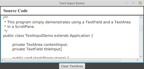
(I pasted the source code of the program into the text area!)
6.4.5 Slider
A Slider provides a way for the user to select an integer value
from a range of possible values. The user does this by dragging a “knob” along
a bar, or by clicking at some point along the bar.
A slider can, optionally, be decorated with tick marks and with labels.
This picture, from the sample program SliderDemo.java, shows
three sliders with different decorations and with different ranges of values:
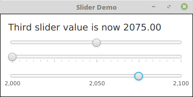
Here, the second slider is decorated with tick marks, and the third one
is decorated with labels. It’s possible for a single slider to have both types
of decorations.
The most commonly used constructor for Sliders specifies the start
and end of the range of values for the slider and its initial value when it
first appears on the screen:
public Slider(double minimum, double maximum, double value)
If the parameters are omitted, the values 0, 100, and 0 are used. By
default, a slider is horizontal, but you can make it vertical by calling its
method setOrientation(Orientation.VERTICAL). Orientation
is an enum from package javafx.geometry.
The current value of a
Slider can be read at any time with its getValue() method,
which returns a value of type double. If you want to change the
value programmatically, you can do so with the method setValue(val), which takes a
parameter of type double. If the specified value is not between
the minimum and maximum slider values, it is adjusted to lie in that range.
If you want to respond immediately when the user changes the value of a
slider, you can register a listener with the slider. Sliders, unlike
other components we have seen, do not generate ActionEvents. Instead,
they have an observable property of type Double
that represents the value. (See Subsection 6.3.7.)
You can access the value property of a Slider, slider,
by calling slider.valueProperty(), and you can add a listener to the
property that will be called whenever the value changes. For example, in the
sample program, I add listeners to the sliders with commands such as
slider1.valueProperty().addListener( e -> sliderValueChanged(slider1) );
The listener will be called whenever the value changes, either because the
user is dragging the knob on the slider or because the program calls setValue().
If you want to know whether the user generated the event by dragging the slider’s knob,
call the slider’s boolean-valued isValueChanging()
method, which returns true if the user is dragging the knob.
Using tick marks on a slider is a two-step process: Specify the interval
between the tick marks, and tell the slider that the tick marks should be
displayed. There are actually two types of tick marks, “major” tick marks and
“minor” tick marks. You can have one or the other or both. Major tick marks are
a bit longer than minor tick marks. The method setMajorTickSpacing(x)
indicates that there should be a major tick mark every x units along
the slider. The parameter is of type double. (The spacing is in terms of values on
the slider, not pixels.) To control the minor tick marks, you can call
setMinorTickCount(n). The parameter is an int
that specifies how many minor tick marks are placed between consecutive major
tick marks. The default value is 4. If you don’t want minor tick marks, set
the count to zero. Calling these methods is not enough to make
the tick marks appear. You also have to call setShowTickMarks(true). For
example, the second slider in the sample program was created and configured using
the commands:
slider2 = new Slider();  // Use default values (0,100,0)
slider2.setMajorTickUnit(25); // space between big tick marks
slider2.setMinorTickCount(5); // 5 small tick marks between big tick marks.
slider2.setShowTickMarks(true);
Labels on a slider are handled similarly. A label will be placed at
every major tick mark, but some labels will be omitted if they would
overlap. To see the labels, you need to call
setShowTickLabels(true). For
example, the third slider in the above illustration was created and configured
to show labels with the commands:
slider3 = new Slider(2000,2100,2022);
slider3.setMajorTickUnit(50); // tick marks are not shown!
slider3.setShowTickLabels(true)
The value of a slider is of type double. You might want
to restrict the value to be an integer, or to be some multiple of a given
value. What you can do is call slider.setSnapToTicks(true).
After the user finishes dragging the slider’s knob, the value will be
moved to the value at the nearest major or minor tick mark, even if the
tick marks are not visible. The value will not be restricted
while the user is dragging the knob; the value is just adjusted at
the end of the drag. The value set by calling setValue(x)
is also not restricted, but there is another method, adjustValue(x),
that will set the value to the value at the tick mark nearest to x.
For example, if you want a slider to snap to integral values in the range
0 to 10, you could say:
Slider sldr = new Slider(0,10,0);
sldr.setMajorTickUnit(1);  // major ticks 1 unit apart
sldr.setMinorTickCount(0); // no minor tick marks
sldr.setSnapToTicks(true);
In the sample program, the third slider has been configured to snap to
an integer value at the end of a drag operation.